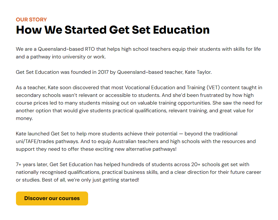
About the Client
Based in Queensland, Get Set Education is an RTO that specialises in flexible school-based training packages and nationally recognised business courses tailored for high school students.
The Brief
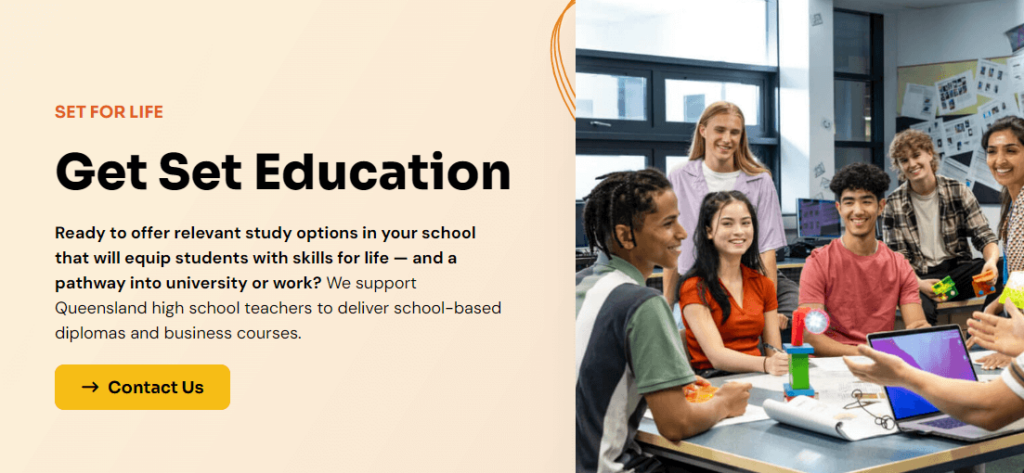
Having DIYed the first few versions of their website, Get Set were ready to upgrade to a more professional website, and reached out to The Digital Brew (my other business) to start planning the project.
I’d already had the pleasure of working closely with the owner, Kate, when she first launched the brand many years back (but DIYed the design). This was back when I was a freshly minted freelance copywriter and still using Microsoft Word to write my copy 🤯
Kate’s goals for this project included showing up on Google for course-related keywords, ensuring the brand would appeal to all their audiences (and stand out from clunky/unappealing competitor sites), and clearly explain their different options.
The Work
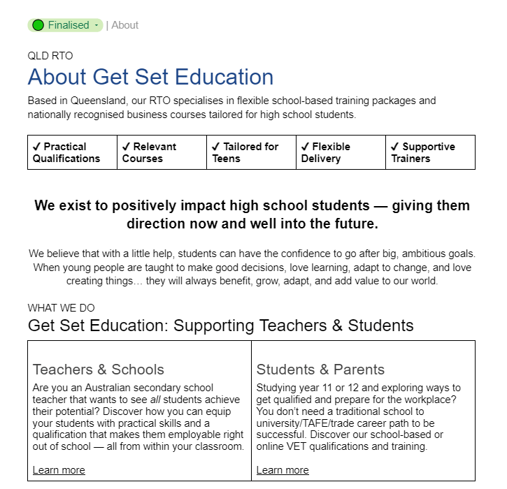
My role for this project focused on SEO strategy, brand voice, and copywriting.
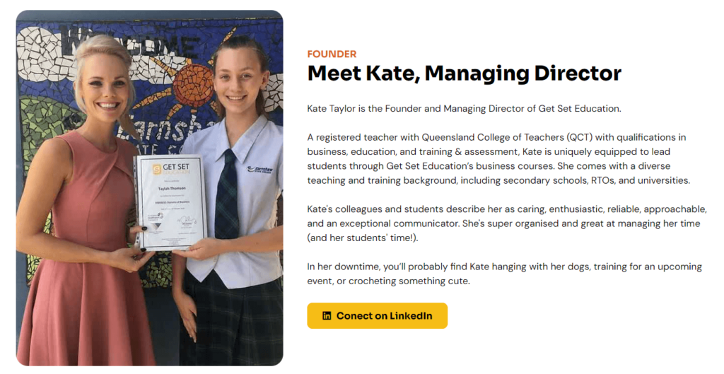
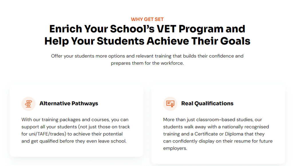
Having already worked on the brand before, this gave me an opportunity to review the keywords we’d chosen, look for new opportunities, and add more content to reflect the current offerings. I refreshed and added to the existing content, creating landing pages for Get Set’s courses and training packages, along with info for teachers, students, and university pathways.
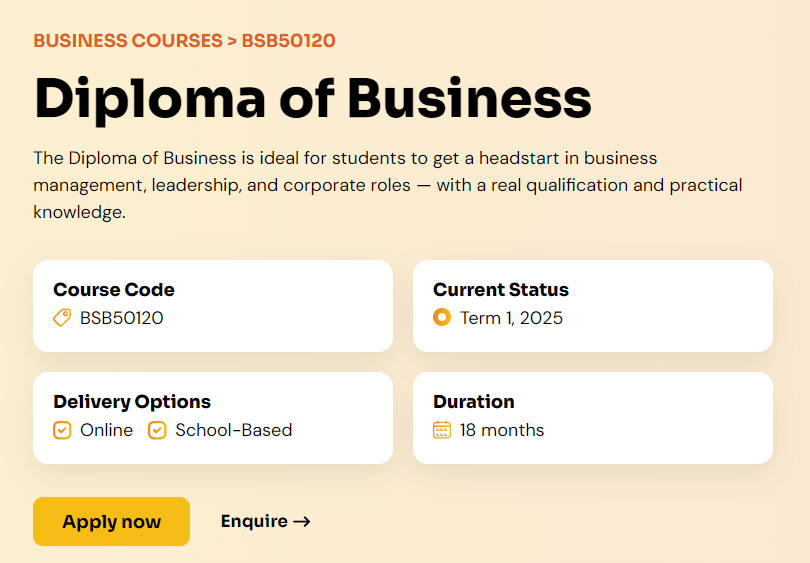
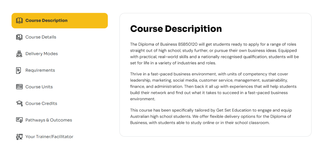
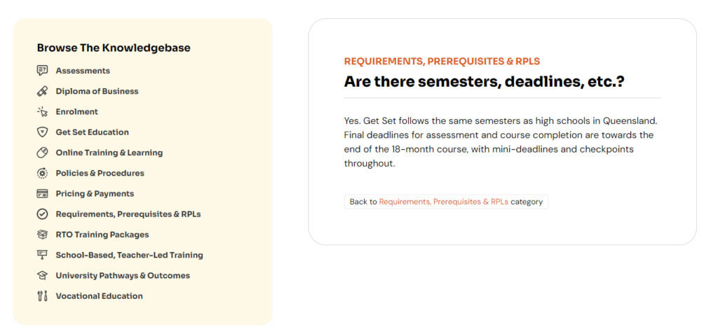
Because there was such a lot of information (and some of it quite complex), we opted to convert the FAQs page into a Knowledgebase, giving Get Set Education scope to build on this in future. We also created a Resources page which is currently being used to link to pdfs like a student handbook, but could also be used for other purposes in future.
Once the copy drafts were completed, Stew (my husband and web designer at The Digital Brew) created the design mockups for client approval before developing the site(s) in WordPress and bringing all the functions to life. Since Get Set’s logo had been recently refreshed by a local graphic designer, he used this to develop an eye-catching design that included peach and orange tones.
